Sunday 10 April 2016

Welcome on site!!


WELCOME

Both IRL and online, here you find All the Cunning Stunts in our intrepid dimensionz... 

Enjoy a blogging derive through our scattered posts 
and/or 
pick and choose from our incoherent tagging logic... 

process is the iceberg


with much Stunt love
XXXX

Monday 21 March 2016

04 - Moodboard


final:


Chez Deep; it's a queer family with a manifesto...

So I went to see an amazing performance by Colin Self last night, and found this collaborative project on his website today...


Chez Deep is a project utilizing a queer family as a site for raising attentiveness to body and consciousness. Initially a drag collective of five gender-variant transhumans, Chez Deep has transformed into a family creating ceremonial evocations, grievances, and celebrations of post-human living through collaged audio and spoken narratives... [see link above for full manifesto]


something to check out post upload, or in the meanwhile. If you can: turn the volume up, especially the bass.

****

Friday 18 March 2016

My Turn!

Hey RO and LA!

Thanks heaps for the work on the mag cover collage. Looking so nice, and I am personally stoked to see FOMO back in all hxr glory!

I made some text changes and responses. I tried to get some colour balance back with the pink and purple (I really liked the kind of all-over colour of the original poster, because it makes the whole thing flatter), this also allowed me to reduce the mag covers that will need to be created by one!

The rotated brush is now in the top left, and I have done a little bit of 'cass' damage control without loosing little snippets of the great colours in the work.

I also added a barcode and let the title of THEIR wander off the page.

Maybe the whole image could shift down a bit, and the "Available anywhere" could go back to the top?


Some Newz 

This is the text I used for the section on the left:

SPOONERISMS!
PARANOID CAMP!
TOOTHLESS MOUTHS!
CONFESSIONAL MODES!
RECOOPERATION  OF FORMER IDENTITY?
LOST ARCHIVE POSITIVISM? 
ONLINE IS THE NEW DROP IN!

With Triangle:


Without Triangle:


Playing around with the balance and focus, purple red yellow green black. One thing I notice in this image is the absence of gradient. I am resisting the urge to make the Available everywhere banner purple red yellow green black. Hmn. I really like the new centre piece! 


more space?

Liz, Really like the colour fades and the yellow Leading Lxdy Saught text, which really clarifies the focus of the central image. 


Just for comparison's sake, and not strictly a proposed image, something to tease out the kind of call-out we're doing. This one's a little, um, ecstatic... (in some contexts, in others border-line rom-com?)

On the whole, I like the conceptual relation of the clothes pile to the search for the Leading Lxdy, it's like they sent their dirty laundry to do their stunt work.... it is a little on the disembodied side, though... which I like, though also am interested in the incoherent self embodied... maybe by that I just mean pleasure... the lipstick is in this vein, though does it mean we're advertising for a lipstick 'type'. Too binary? That doesn't sit well with an open casting call...  however, I do like a bit of rom-com sex appeal in relation to the mag cover vibe...

These are my final discussion points I think, otherwise I'm thinking we go with the clothes pile as of the most recent iteration.

MS new version:

An attempt to simplify more! And do do a little Man Alone modernist painting F+ historical grading. 


Brushing up on an obsession, going subliminal


Yup, that's the shaving brush - again! 
Brushing something...


Working with Liz's excellent Mag no. 3. I added the top 'Available Everywhere Depending Where You Are' back in from Liz's Mag cover options 1&2. I added the squished (new and improved) shaving brush as a kind of 'celebrity portrait stand-in and added the slightly transparent heart-hands over top - adding to the dimensionality of the top image from Liz's original that's slightly excerpted with shadow. I also included the text from Liz's Mag covers 1 & 2 - so the 'Lost Archive/Positivism/Online is the new drop in!' list and inserted it behind Liz's original front layer. 

I am a bit worried that the Rita Angus Trust (?) getting copyright worried on us about the Cass image, so I decided to put in a section of waterfall from the same image in the Red Cross window instead, just as an option. From there, this happened....


A waterfall as watermark has sublimated the mag cover collage cacophony - too silenced?

Return to form? Or partial form?


Thursday 17 March 2016

Cover UP!


New version with more room to read (before and during part-coherency):

before

during


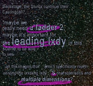
...remembered the heart of the project, search for Leading Lxdy of multiple dimensions <3


This is a pretty amusing process, meta meaning text combo... A super quick draft for communication with the morning time zone

Wednesday 16 March 2016

All hail Clare Noonan, plus we're nearly there

With little time for humbleness we wish to express our loud proud thanks to Clare for creating, polishing and perfecting such an amazing series of print-ready files! Thank you CN! What a feat! Thanks also Marnie and Liz for your collaborative elan in this process!

Hell, a website image, map and six completed street-ready works, we're phenomenal! Now is the time to digital hug within a shroud of mystery, though only appearing so on the outside, for inside we are comfortably dressed, caffeinated and forward-organised so as to support each other for phase 2.0 of file prep. Clare, please let us know how you are and any practical/moral support we can give you at any point! LOVE!!!

First, fancy lettuce recap our achievements to date! 

Web image:


Map


Mounted on Manchester:

Community garden


Red Cross shop


Wellness centre


North Projects gate


Next phase of file prep and delivery: AKA 6 down, 3 to go

We are pushing ourselves this week for file prep so lets stay heartened, organised and streamlined as much as possible... we can do it. Sunday deadline? for three outstanding posters, though we need to discuss/recap our options on the Bollards me thinks.

To do:


1. Physics Room stairwell poster, latest woahnder by MS (looking dapper!) Due Tues/Wed 


2. Bollard 1/Currently behind fence - poster, collage of mag covers (do we do this?) Due Mon/Tues


The fence means pedestrians won't be able to look at it, so visibility will just be from cars/buses/horses. There doesn't seem to be much point going ahead with this bollard in my opinion. Plus we are also over budget...

However, discussing this a bit with Liz earlier, the magazine cover is a key aspect of our concept/media landscape so if we don't go with this work here as planned, perhaps we find an alternative way of sharing this work, and or the mag covers developed for it.

Liz suggested a Facebook or Instagram or blog release of the magazine covers, a kind of time-release collage, multi-dimensional cover launch. I like it! Let's ponder. Alternately we find another physical location to mount it?

I'll do a post after this one that gathers the source magazine covers for this image as well as the other options we posted so that we can get a sense of scope/options/mockup requirements.

This poster will require the most effort/time/organisation so just getting the pixels rolling.

3. Bollard 2/Margaret Mahy park - poster - Due Mon/Tues 

'FAQ, a reality...', latest mock-up by MS (we can't do a ring around this bollard as planned, as it's is too popular, so we go for single A1 poster?)


The above version (without the clocks)

Let's shoot the breeze over our options, share our availability over the next days and consolidate an extremely sensible plan (et) of activity.

xxxxxxxxxxxx xxxxxxxxxxxx xxxxxxxxxxxxx xxxxxxxxxxxxxx xxxxxxxxxxxxxxx xxxxxxxxxxxxx

instagram?


proof 06

I present: Fo-Mo:


Rainbro is being produced now, but will be a reverse of this one, so any feedback will be useful for that one too. A little note, we are crazy close to the wire in terms of deadline #2, and the warping of the newspaper is quite labour intensive and slow with such a huge file. Rotating, shrinking and stretching are fine though!

And the two together:


proof 09


Prooflooking hot and a predictable response from LA, who is searching for a textural contrast between oh-so smoooooth and hot-mess raggedy pixels...


Urgent LA

Hey Liz,

When you are back from class, can you try to find a better quality or location for the first image in the paravant:


It's too pixley for me to find using Google images!

And, also, for the google map, for the life of me, I cannot get North Projects to appear the way it does in yours. Would you be able to add a link to the map search that will reveal both the Physics Room and North Projects? Then Clare can take a screenshot on her HUGE screen.


Our situated-ness at a glance